This week’s Module 2 in Visualization of Big Data started well. I enjoyed the videos in the module. I especially was taken by these words from Using Data: Art of Data Visualization | Off Book | PBS Digital Studios
https://youtu.be/AdSZJzb-aX8 (Links to an external site.):
“The history of visualizing data is the history of science.”
“…respect your audience and really know your content…”
“…look after truth and goodness and beauty will look after herself…”
These are heady thoughts and adding to that this from an article on Medium by TED Fellow, Karen Frances Eng:
“The big lesson: we missed an enormous chunk of the Tree of Life because it looked just a bit different from what we assumed life should look like…”
And I was excited to get started on the project for this module. It seems pretty straightforward: download a CSV file of data from a Florida Government site that is posted in Canvas. Once downloaded, get it into a spreadsheet and do something interesting with it, how hard can that be? First I wanted to try Google Sheets because it looks less complicated then Excel. I watched a video from the Synch Sisters: https://www.youtube.com/channel/UCATd_y-cwDRTZtDULeGg42A, they made using it look so simple! Sadly, Sheets didn’t like the CSV file, it was too large. So I switched to Excel and was surprised to see that the file was imported successfully. In my brief introduction to the two, I was under the impression that Excel didn’t like big files either. I now had thousands of rows of … something…, I just had no idea what to do with it.
The file looks to be a list of businesses that have contracted with the state. There are lists of codes that have no meaning to me so I based that assumption on the values in the columns ORG NAMES and INTEREST TYPE. I looked up the DUNS Number heading and learned that it is a unique identifier that can be assigned to businesses and is a requirement for certain government contracts and grants. If it had been used with more of the ORG NAMES it may have been a useful way to slice up the data.
One value that caught my eye occurs in the “INTEREST_TYPE” column, the “UNSPECIFIED UNIVERSE” exists among STATE MASTERS, TRI REPORTERS and various other names and acronyms. I can’t help but wonder why it is an “unspecified universe” and not simply unspecified…
Another eye catcher is the inconsistency in the data. Some zip codes were entered as nine digits, some as five and some were somewhere in between. This bothered me because I thought I might be able to at least sort by zip code, but I would have to edit thousands of lines of cells and that seemed like an incredible waste of time. If I knew more about Excel there is probably a way to automate it but I think I will save that for another day. In addition, zip codes don’t really tell much of a story in this situation. Another inconsistency is the business names or “ORG NAMES.” A person’s name is listed given name first and then sir name first, there is no punctuation to indicate this, I am just assuming it. Business names are usually consistent but not always and on further inspection it seems most of the variation may be related to the category “AFFILIATION TYPE.”
My next step is to try to learn what Pivot Tables are and how to create them. I think this will allow me to create something visual and to count or at least describe something such as how many UNSPECIFIED UNIVERSES are there?
Update:
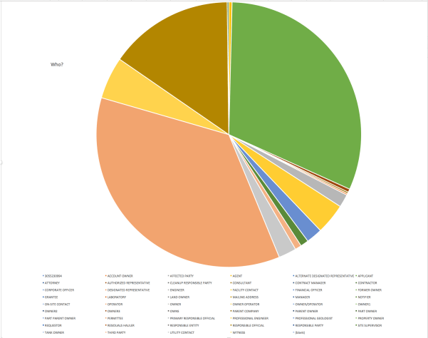
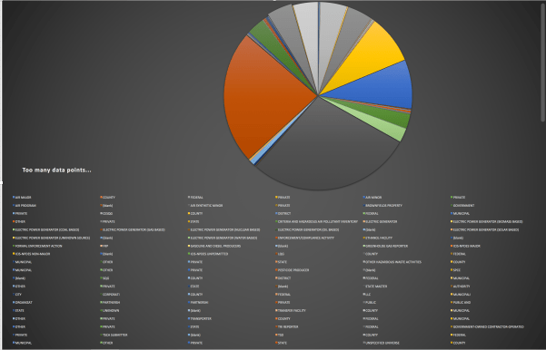
Learning about Pivot tables seems to be the way to begin to visualize data in both Excel and Google Sheets (Synch Sisters again). I started with the Pivot tables and I played around with several “pies” in Excel, while getting familiar with the Pivot Table function. I tried other types such as bar charts and various options but none really worked with the data. I haven’t come up with a spectacular visual but I am beginning to understand how it works. I am still not sure what sort of story I can tell with this data, I think it will have to be separated in some other ways…perhaps using subsets of the list.
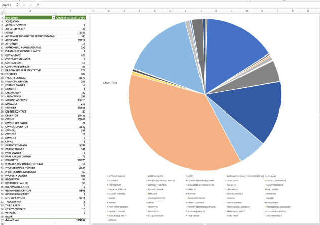
I was mainly trying to find the relationship of the INTEREST TYPE to the AFFILIATION TYPE, especially curious about those UNSPECIFIED UNIVERSES… I have some other data I want to play around with: an Excel file of all Florida Licensed LMTs (licensed massage therapists) as of January 2016 and I downloaded some health survey data from data.gov since I am also taking Health Librarianship this semester. When I first had the LMT list, I needed to get the LMTs for Monroe county to update our email list but for visualization purposes I would like to see what it looks like per county in Florida and then per zip code in Monroe County. No real reason, I have just always said that of 150-200 LMTs in the Keys at least 100-150 of them are based in Key West and I would like to see how close I am.
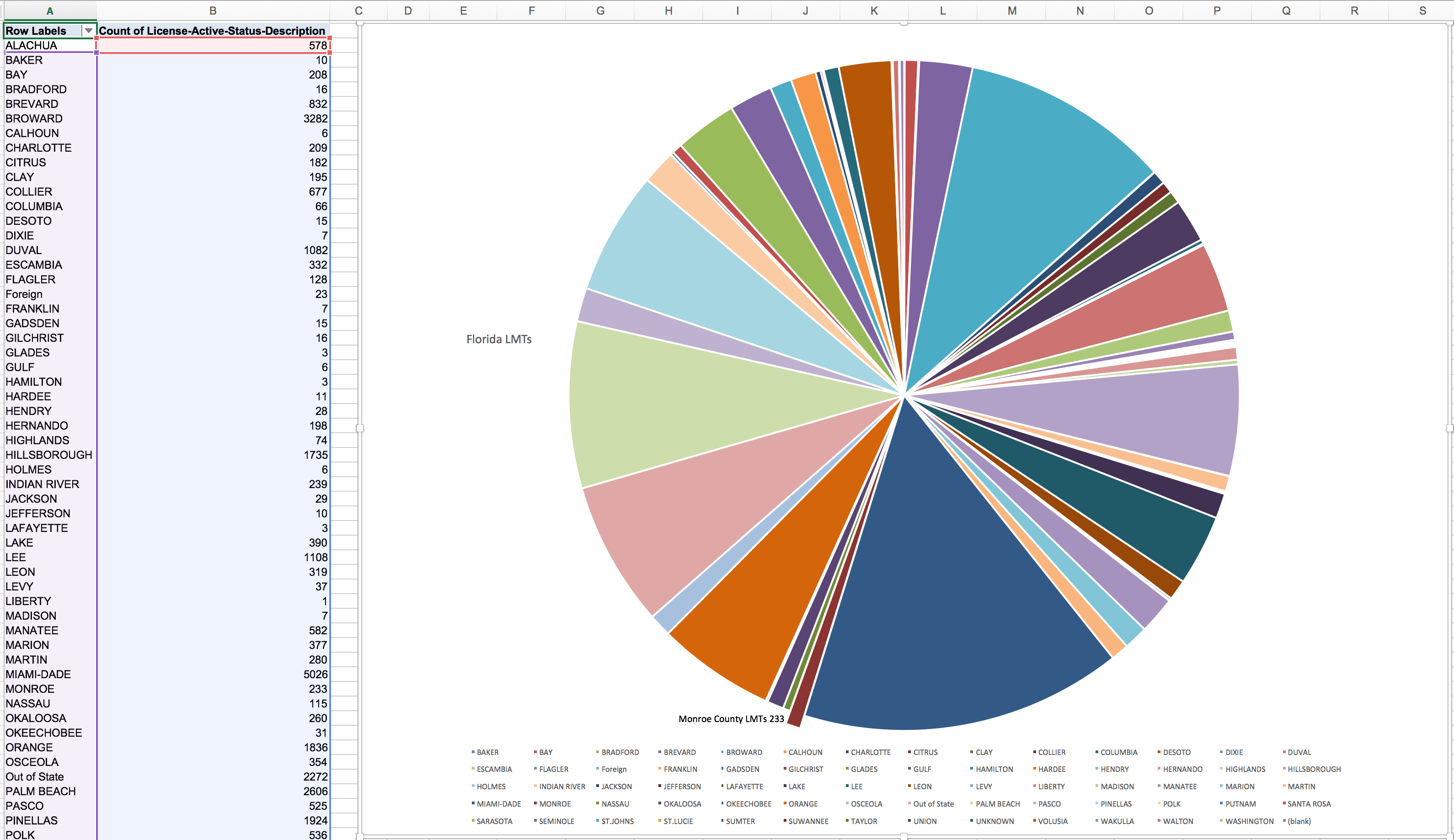
I get to see how we break down by county but I am still playing with the smaller file. I have a lot to learn about using spreadsheets and generating charts and visualizations in them but I will get there!


Leave a comment