This week we are beginning to work with a web based software called Plotly. Plotly has a free version as well as a tiered pricing structure, with a discounted rate for students. Code is also available for those that want to work more deeply with the program. In addition to being able to create visual representations of data in Plotly we can also calculate descriptive statistics as well as run other analysis. As I had already done this the other day while exploring Plotly, I thought it would be a breeze but after importing the data, I haven’t been able to get any values when I run the descriptive statistics analysis. Back to the tutorials…
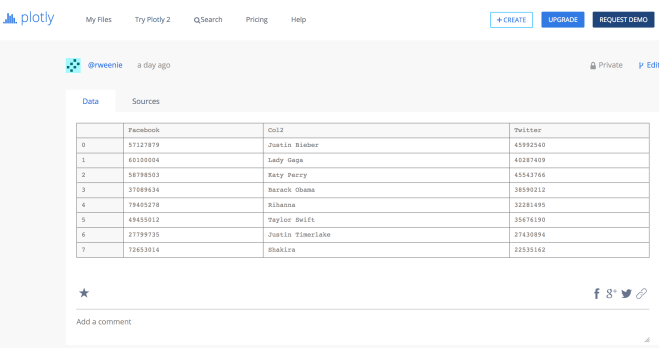
Well that was simple, the data was not formatted the same way on the second import as the data I had started with. When I imported the file today the Facebook column was imported as ‘column 0’ with ‘Facebook’ being the value in the first row, and the same for the Twitter column. Because of this, descriptive statistics could not be calculated. As I still had the original file in Plotly, I returned to it and was able to use it.
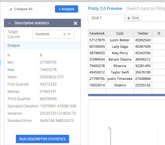
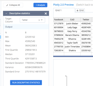
There are 8 values in both columns; the descriptive statistics are calculated with the touch of a button. This is a very useful tool, now to create some visualizations.
I decided to try a scatter plot first. I initially used column 2 for the x-axis and the Facebook column as the y-axis values. By using the ‘Trace’ feature, I can create a second scatter plot with the Twitter data and they are plotted on the same graph. In addition to choosing the x and y axis, size can be set so that it shows relative to other totals and the hover text can be set to show the actual number. There is a menu bar in the upper right corner of the plot as well but it doesn’t show in this picture. There are zoom buttons and selection tools as well as two settings for the hovering, one shows the closest text the other shows both values. So when I hover on Shakira’s Facebook or Twitter values both are shown. Another useful feature.
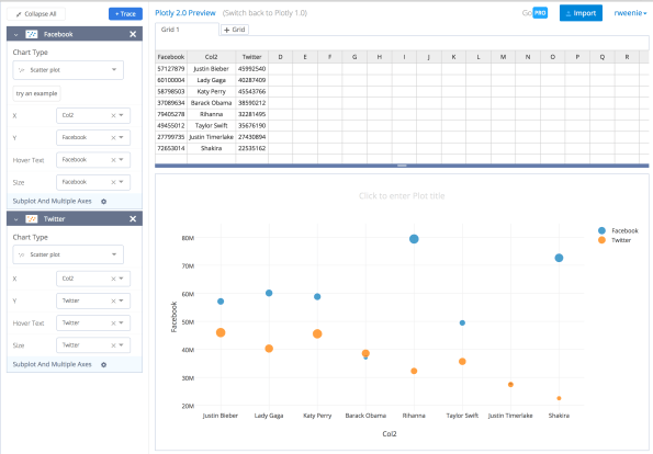
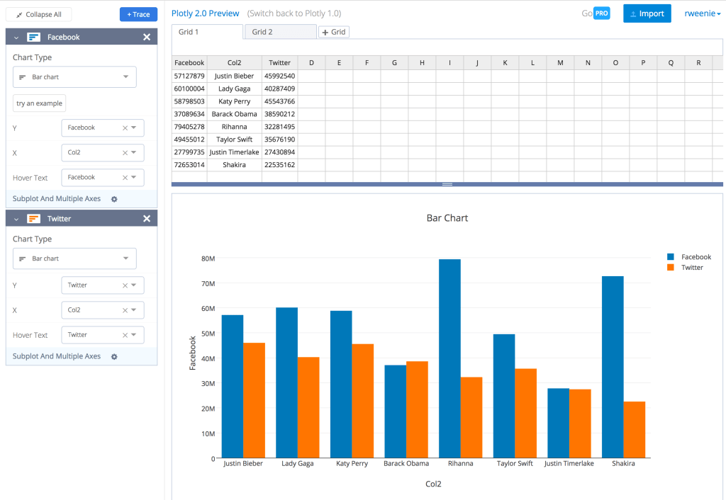
Even with the comparison feature this isn’t really doing anything for me. While it does represent the relative numbers for each person, it just doesn’t seem to speak to me. So back to the drawing board. With the click of a button, I have a new chart. To my eyes, the bar chart allows for a clearer comparison of the two values for each individual, as well as a clearer idea of how each person compares to the others.
I hadn’t tried out the sharing feature nor have I figured out how to save properly. I thought I had saved the scatter plot but when I created the bar chart the scatter plot wasn’t saved.
I did try to create a link for sharing: https://plot.ly/~rweenie/2/?share_key=oOjjgL27lP59AkruwCKClg so let me know how it looks!


Leave a comment