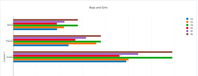
This week we are to delve further into Plotly and attempt to grasp the Analysis functions, such as the descriptive statistics, column correlations and perhaps even an attempt to understand Chi squared analysis. My first attempt didn’t work out so well, as the data didn’t make a lot of sense to me the way it was laid out. I decided to make two grids separating the ‘Boys’ from the ‘Girls’ and I decided to assume that the row labeled ‘Goal’ was actually indicating grade level and could be taken out of the analysis as well as the visualization. It was the only thing that made sense, also because the numbers in that row were outliers compared to the other numbers and affected the descriptive stats. I labelled the columns in the graphs by grade level and gender.
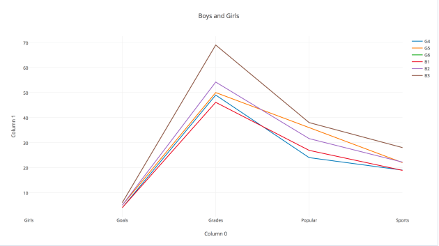
Using the ‘Trace’ feature to create visualizations I created several The bar chart above and a line chart below done before the ‘Goal’ row data was removed.
Next I looked at the ‘Analysis’ feature and ran descriptive statistics for each column and ran column correlations on each column comparing the data for the boys in each grade to the data for the girls in each grade.
I added the descriptive statistics and column correlations to another grid and created a scatter plot of the data. I think that the closer to 1 the column correlation is, shows that the responses are more alike between the two columns of data being compared. I am not quite sure how sharing works but this link should take you to the data. https://plot.ly/~rweenie/8/
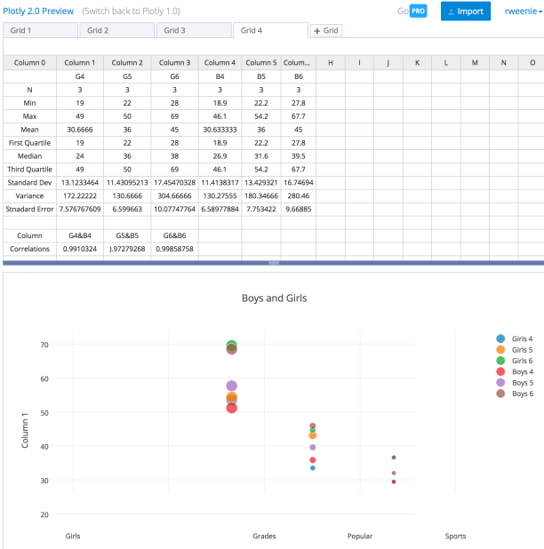
It seems that there is a high correlation, which suggests that girls and boys are similar in what is most important to them. I decided to add column correlations between the grade levels to see what the variation might look like. If I understand column correlations correctly, its seems that there is little variation among the boys by grade level, while the girls vary a bit.

Plotly seems like a useful tool, unfortunately the tutorials seem to be for a different version so it is a bit difficult to follow, for now.


Leave a comment