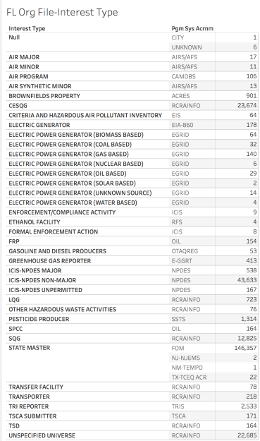
The assignment in Project 2 is to return to the Florida Organization File and using some of the new tools create three visualizations that say something about the data. Returning to Project 1 to remind myself of what I learned in my study of this file, I see that this seems to be a file containing details of interests in Florida that must deal with an environmental impact in some way. For example, the <Pgm Sys Acrnm> RCRAINFO refers to Resource Conservation and Recovery Act Information and NPDES stands for National Pollutant Discharge Elimination System. The category INTEREST_TYPES provides more detail regarding the types of materials the “interest” is using or disposing. There is also more detail about the various Interest type codes and what they may mean in the Project 1 report.
While the instructions encourage us to try Plotly or Google Fusion I wanted to try the Tableau platform I downloaded as a free student version. I was hoping to create the three visualizations and make a dashboard that I could share. I was able to create an interesting visual of the organizations by zip code filtered by the code for Key West, but then something happened and it went away. So I am turning to Google Fusion.
I was able to upload the file and my first attempt was to use the map feature. And this is why I am still working on this in the eleventh hour. Google Fusion keeps freezing up before I can do anything, the file is too big for Plotly, I have pulled it back into Excel and deleted columns I don’t want to deal with and now Excel won’t save it! I finally managed to save it locally and again tried to get the edited version into Plotly but it is still too big. Every time I have begun work on this project over that past couple of weeks I find myself frustrated by something like this, so I set it aside and come back to it only to find I am still frustrated!
Back in the Tableau camp, it now it seems to be working again. I am able to look at the data and create a chart but now I am reminded of why it is so frustrating to create a visual with this data. Some of the categories are so small that they barely show up and one is so large that it is by far the majority and that is the one I was not able to learn more about when I searched for it while working on project 1. I was able to find reference to almost all of the programs listed under Pgm_Sys_Acrnm except FDM.
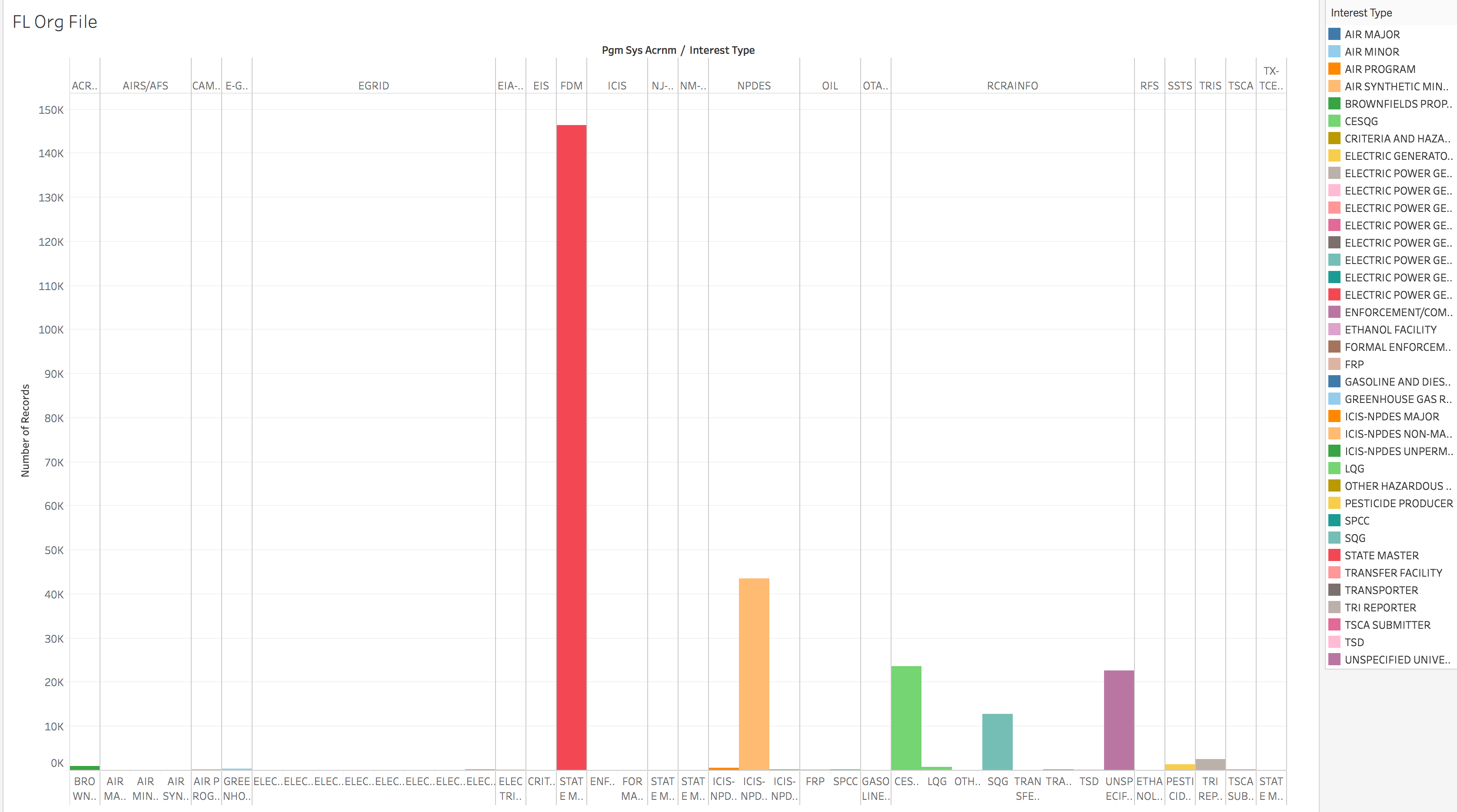
I am not sure yet how to share the actual Tableau file so that it can be accessed but it is interactive, which could make it a great presentation tool. Hovering over each data point, even the tiny almost invisible ones brings up the <Interest Type> name, the <Pgm_Sys_Acrnm> and the number of records (the way I have it delineated). Clicking the bar brings up a menu and one choice is to exclude it, so I excluded the FDM field. Although I have had trouble with sharing screencasts before you can try this link that shows this tool tips feature: http://www.screencast.com/t/Jd0Cr6TF
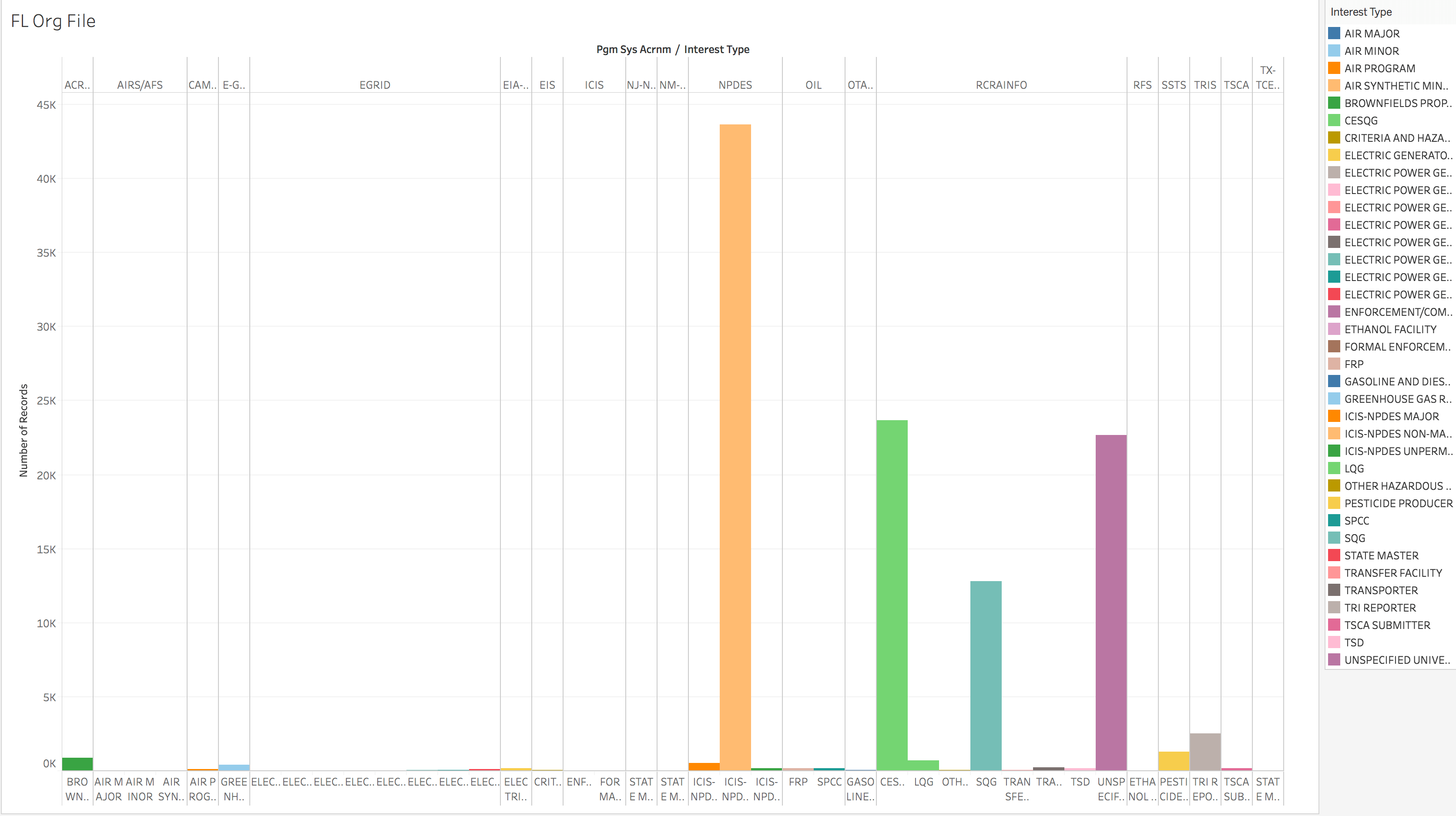
After excluding FDM, there are still too many tiny fields to make it a great visualization but it is a bit better. It would be interesting to explore the tiny EGRID values, as you can see from the first chart at the beginning these are various types of electric generating interests, of them all only two are solar. Here is the link to the screencast after the FDM field was removed: http://www.screencast.com/t/LQeK6WXMT.
I find it disturbing that this file obviously contains data regarding hazardous waste and toxin management programs that the state administers and yet the largest portion of it is a category I wasn’t able to locate information on and the interest type is simply State Master. In the project 1 search I did on these programs, almost all were clearly defined with details available in several locations.
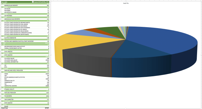
Since I was having such a difficult time with all of the platforms, I went back to Excel and made a pie, because I am hungry!
I also decided to give Google Fusion another try before signing off. I was able to play a bit with the map feature and it didn’t freeze! I learned that there is a filter feature and discovered that while many of the smaller program categories and interest types vanish when selected, the FDM/State Master category is country wide. There are also records for interests with addresses in other countries too. Since the map is using the State Code, I am not sure how it choose the other countries…
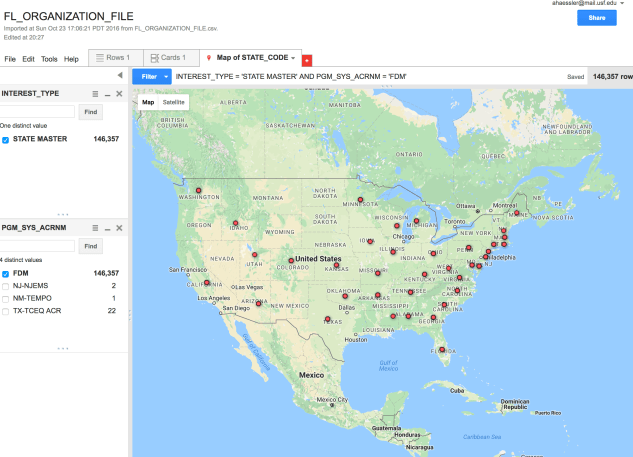
When I used this feature before, I hadn’t discovered the filter feature. I will be playing with that more in the future. I am not sure what will happen if you access it with this link: https://www.google.com/fusiontables/DataSource?docid=1_Hr6rby9l6Ah3hDBId5dpHHeBWWsM1WNAyv7CzVV but feel free, I will be having some dinner now!


Leave a comment